Overview
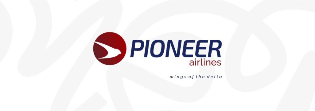
Pioneer Airlines is an indigenous charter airline operating in Nigeria. The company’s mission is to connect Niger-Delta cities with short hops, hence their tagline “wings of the Delta”.
When the airline set out to rebuild its brand identity, I was brought in to lead the redesign. It was my first identity project for an organsation operating at this scale; but alas, the mark i created now sits on aircraft livery, crew uniforms and every physical and digital touchpoint of the business.
The Brief
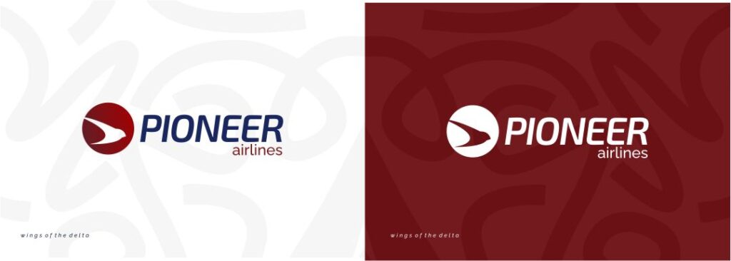
Pioneer Airlines needed a mark that felt rooted in the Niger Delta, while still reading as a credible, modern regional carrier. The brief said that it should have a semblance of wings to correspond the “wings of the delta” slogan. They also wanted something that could be placed side by side with the logos of international carriers.
The Process
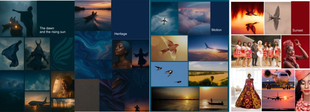
I started by mapping visual territory through mood boards. I explored the masquerades which signify heritage and tradition; I looked at integrating wave forms tied to the region’s Atlantic coastline alongside a third direction built around the swallow, a bird with strong regional presence and an obvious metaphor for flight.
I sketched multiple studies of the swallow, different postures, different levels of abstraction, before landing on the direction that tested best with stakeholders: the bird caught mid-flight, diving across a radiant sunset.
That image became the anchor of the final mark.
The Design Rationale
- The swallow is native to the region and known for its agility and its instinct to return home.
- The dive across the sun reads as dawn, energy, and forward motion.
- The circle encases the mark to represent unity and wholeness, and gives the icon the discipline it needs to work as a small, repeatable asset — a tail fin, a favicon, a lapel pin.
- The gradient across the logomark is a deliberate motion cue, visualising constant motion and a smooth journey.
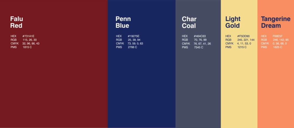
- Falu Red, pulled from tones recurring across Ankara fabric (the textile most associated with local dress during formal occasions) ties the mark to regional material culture. It’s paired with Penn Blue and Charcoal as the core system, with Light Gold (the tropical sunrise) and Tangerine Dream (the tropical sunset) as accent colours.
- The wordmark uses a custom-adapted typeface set on a slight skew, echoing the same forward motion carried by the bird and the gradient — “PIONEER” in Penn Blue, “airlines” in Falu Red, with the tagline “wings of the delta” underneath.
Every decision traces back to one goal: a mark that couldn’t be mistaken for any other airline’s, because it couldn’t have come from anywhere but this coastline.
The Outcome
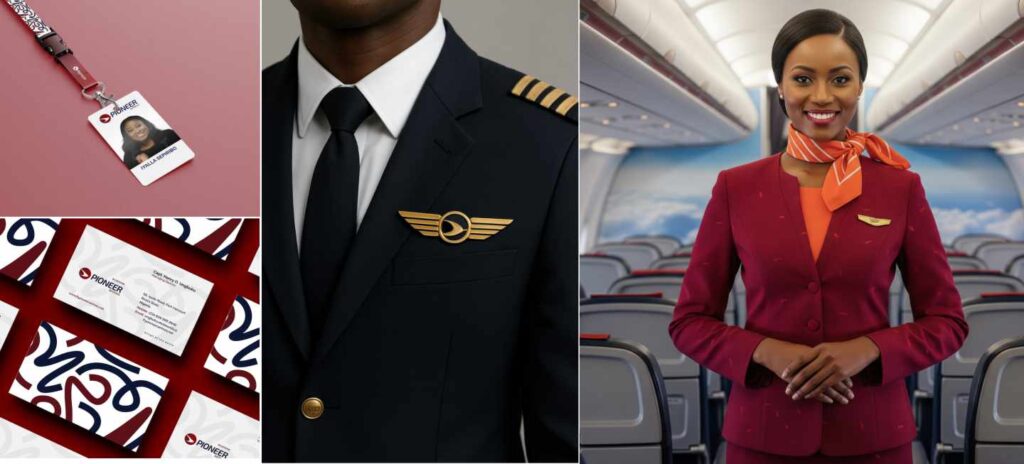
The mark became the foundation of a full brand system, now in active use across:
- Aircraft livery – tail fin and fuselage striping
- Crew uniforms and wing pins (gold and silver).
- ID badges, lanyards, and business cards.
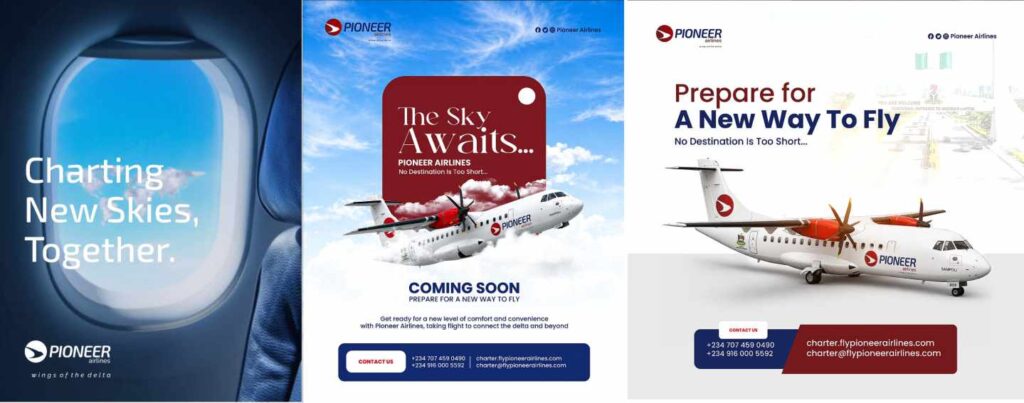
- Campaign material -including the “Charting New Skies, Together” launch messaging.
- Digital and social platforms, where the icon alone works as a standalone favicon and avatar.
The identity is documented in a full brand guideline with logo usage and clear-space rules, colour and typography specification, an aerodynamic-airflow-inspired pattern system, and imagery direction, so it can be applied consistently by anyone working on the brand going forward.
[View live: https://charter.flypioneerairlines.com/]